


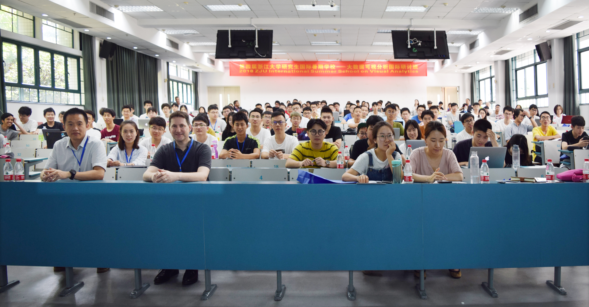
The 4th ZJU International Graduate Summer School on Visual Analytics was successfully held from July 27th to August 7th. The summer school was hosted by the China Society of Image and Graphics, the State Key Laboratory of Computer-Aided Design and Computer Graphics at Zhejiang University, the Human-Computer Interaction Committee of the Chinese Society of Image and Graphics, and the Computer Aided Design and Graphics Committee of the Chinese Computer Society.

Dr. Wu Yingcai hosts opening ceremony

Prof. Tobias Schreck gives a report
Prof. Tobias Schreck from the Technical University of Graz, Austria, presented a report entitled “Introduction to Information Visualization and Visual Analysis”. In the report, Prof. Tobias introduced the basic principles of research and application of information visualization and visual analysis methods in a simple manner, then demonstrated how information visualization and visual analysis can solve geospatial, high-dimensional and social media data in application examples.
Professor Chen Wei from Zhejiang University gave an in-depth introduction to data visualization from three aspects: what is visualization, what is the current state of visualization development, and how to visualize. Prof. Chen Wei concluded: we visualize because it can help us think, reduce user burden, assist user memory, improve user cognition; acquire, understand, process data in order to extract value from it, and effectively convey information. We now have easily accessible data, so visualization will be a crucial technology for decades to come.
Professor Kwan-Liu Ma from the University of California reported the topic Interactive Visualization and Visual Analytics. Professor Ma emphasized that interaction is the foundation of visual research, and interaction design has become an essential topic in many research fields. Interaction design is based on the user's needs, and should be able to change and adjust the visual representation according to the user's expression. People can use visualization to validate proposed hypotheses, analyze data sets, explore information in mining data, tell story in data, and display the beauty of data.

Researcher Shi Lei in Q&A
Shi Lei, a researcher at the State Key Laboratory of Computer Science at the Institute of Software, Chinese Academy of Sciences, reported the topic of “Tree and Graph Visualization”. Professor Shi first demonstrated ten types of graph (network) visualizations, then explained the classic graph layout algorithm, and ran several programs on site to show the visualization of dynamic networks. For hierarchical data, it can be represented by tree visualization, which has node edge representation, space fill representation, and so on. The part where Shi Lei elaborated onQR code generation and visualization of the personal network of scam senders were especially refreshing.

Associate Prof. Pu Jiansu gives a report
Associate Professor Pu Jiansu from the School of Computer Science and Engineering, University of Electronic Science and Technology of China gave a report entitled Tableau - Brief Introduction and Basic Courses, which explained the basic knowledge and usage of Tableau data visualization analysis software. Tableau software helps people quickly analyze, visualize, and share information. In addition, Prof. Pu also introduced the development of the database, and shared some interesting experiences in the research process of visualization and data mining.
Prof. Rüdiger Westermann from the Technical University of Munich, Germany, introduced visual design methods and coding rules. He answered the question “how to judge if a visual design is good or not?”Prof. Rüdiger Westermann introduced interesting design metrics such as “lie factor” and “data ink ratio”, and demonstrated the influence of observation angle on the visualization of 3D pie chart with an intuitive example. His report was very impressive to the audience.

Prof. Stefan Bruckner discusses scientific visualization
Professor Stefan Bruckner of the University of Bergen introduced and explained relevant knowledge of scientific visualization. Scientific visualization is widely used in the fields of medicine, biology, geological science and engineering. It can be divided into volume analytics, flow analytics, information visualization and visual analytics. Prof. Bruckner focused on the first two visualizations in his report.

Benjamin Renoust gives a report
Professor Benjamin Renoust from Osaka University mainly presented content revolving tree and graph visualization analysis. Among them, graph data mainly refers to relational data such as network data (including transportation networks, social networks, neural networks, protein networks, and various abstract relation networks, etc.). Later, Professor Benjamin Renoust explained some basic knowledge of graph, including the basic elements: point, edge, neighbor, connectivity and distance, introduced the classic seven-bridge problem and analyzed some classical algorithms, and explained a tree is by definition a special kind of graph.
Prof. Wang Yunhai from Shandong University gave us the report titled “Overview of Visualization Process”. Prof. Wang talked about the use and existence of data in the context of big data, and proposed the concept of visualization, which is used to allow us to better understand and use a large amount of data. At the same time, Prof. Wang listed examples and interactions of Anscombe’s Quartet Dataset and QQ communication data to help everyone better understand the basic concepts of visualization.
Professor Jaegul Choo of the School of Computer Information Engineering at Korea University focused on machine learning, visualization, and visual analysis techniques that combine the two. In the report, Professor Jaegul Choo explained text data visualizationin detail. The main contents were divided into vector coding of text data, basic text data visualization techniques, topic models and data dimension reduction.

Prof. Issei Fujishiro receives the commemorative certificate of honorary lecturer of the summer school
Professor Fujishiro from Keio University has made a report entitled VR/AR-Based Visualization and answered the question Why should VR/AR be used in the field of visualization: 1) VR and AR can form the first person experience of immersive analysis; 2) VR can fully mobilize people's five senses and support multivariate visualization; 3) AR can superimpose computer-generated graphics onto real-world scenes and support juxtaposition analysis.
Professor Mao Xiaoyang from the Visual Computing Laboratory of Yamanashi University in Japan focused on computational aesthetics, emotional rendering, non-photorealistic rendering, texture synthesis, and visualization. In the report, she explained flow visualization in scientific data visualization.

Prof. Sun Guodao communicates with students
Professor Sun Guodao from the School of Information Engineering of Zhejiang University of Technology is mainly engaged in research on big data mining, visualization and visual analysis. In his report, Professor Sun explained the latest developments in text visualization and social media data visualization.

Researcher Wu Yingcai shares info
Dr. Wu Yingcai, a researcher at the CAD&CG Lab of Zhejiang University, explained the visualization of high-dimensional data and urban data. Prof. Wu also introduced two applications of visualization in cities: “Smart AdP” system recommends the location of road billboards on the map by analyzing traffic flow, vehicle speed, driving trajectory and environmental conditions; “Route-Zooming” algorithm draws time and space data on the map.
Prof. Zhou Zhiguang from Zhejiang University of Finance and Economics brings interpretation of geographic information visualization and statistical chart visualization. Geographic information visualization is roughly divided into geographic information data visualization and spatiotemporal data visualization. Prof. Zhou pointed out that many charts have gorgeous appearances, but they can't pass data features very well. Some charts can get better results by simple coordinate transformation and coordinate zero adjustment.
The last speaker was Dennis Thom, a postdoctoral researcher at the School of Visualization and Interactive Systems of the University of Stuttgart, Germany. Dr. Dennis's research interests include visual analysis, data mining, information query, and social network visualization. He also co-developed the Scatter Blog social data monitoring system. On the day of the summer school, he gave a speech titled “Visual Analysis of Geographical Social Networks”.
The summer school attracted more than 200 visual researchers and enthusiasts from home and abroad. It has effectively promoted communication among young scholars in related fields and will stimulate extensive cross-disciplinary cooperation among scientists.
The summer school website: http://www.cad.zju.edu.cn/home/vis-summer-school-2018/
